What it is
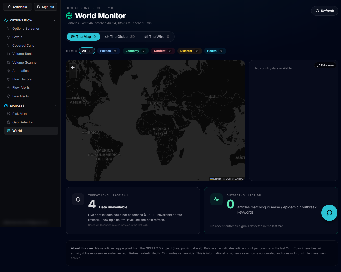
The World Monitor aggregates global news signals from the GDELT 2.0 project into a live map/globe/wire view of the last 24 hours of world events, plus a DEFCON-style geopolitical badge and a disease-outbreak card. It's built for a quick read on what's happening globally that could move markets.
Open it
Use the left rail to open the World Monitor, which loads at /account/world. An active subscription is required — otherwise you see a "View plans" prompt instead of the monitor. Data is cached server-side for 15 minutes; use Refresh in the header to pull fresh data on demand.
The Map, Globe and Wire tabs
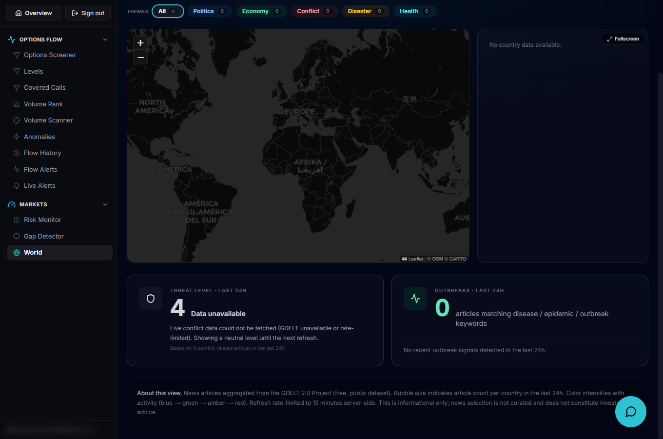
Three tabs switch how the same event data is displayed: The Map plots country bubbles (sized by article count) on a 2D map with a Top Countries ranking panel; The Globe shows the same country events on an interactive 3D globe; The Wire is a plain scrolling list of the underlying articles. Both the Map and Globe support a Fullscreen toggle.
Theme filters and the country panel
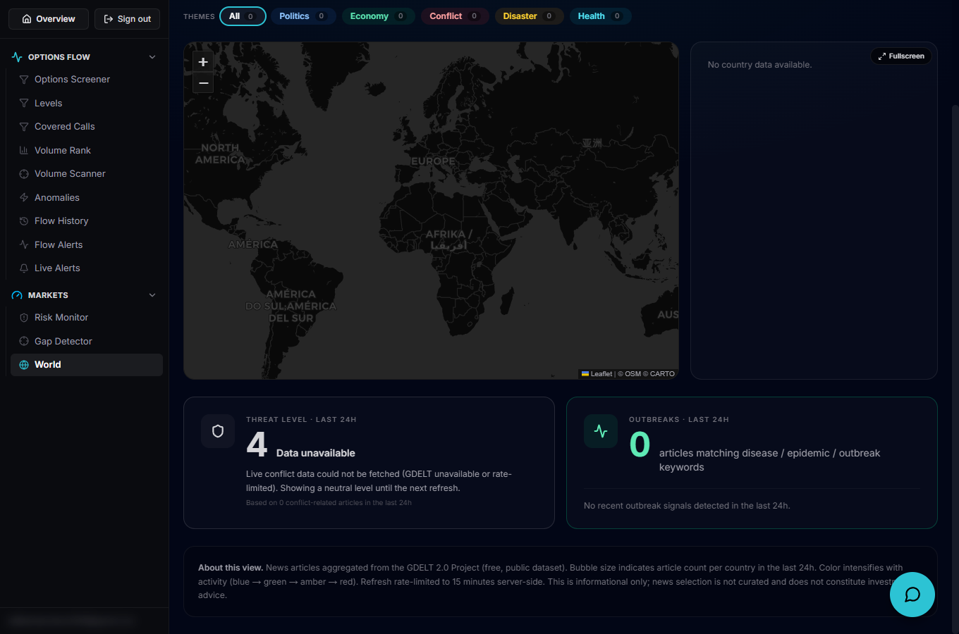
The Themes row lets you filter to one or more categories — Politics, Economy, Conflict, Disaster, Health — which narrows both the map bubbles and the article counts to matching stories (All clears the filter). Clicking a country bubble or a row in Top Countries opens a side panel listing that country's recent articles with source, time and theme tags, each linking out to the original story.
The DEFCON badge, outbreaks and the ticker
Below the map, a DEFCON-style badge summarizes overall geopolitical tension, next to an Outbreaks card tracking active disease-outbreak signals. A live ticker along the bottom scrolls the most recent headlines (respecting the active theme filter) for a quick continuous read.
Use it as context, not a signal
Treat spikes in bubble size or ticker volume around a country or theme as a prompt to read the underlying articles, not as a standalone trade trigger. As the in-app disclaimer notes, news selection here isn't curated and this view is informational only — it doesn't constitute investment advice.