
Reading Net Premium Flow
See net call vs put premium flowing into a ticker intraday — direction and conviction at a glance.
What it is
Net Premium Flow tracks the dollar premium bought vs sold on calls and puts for a single ticker over the current session, bucketed into roughly 5-minute intervals. It nets buys against sells inside each bucket, then cumulates the result across the day so you can see which side — calls or puts — has been building up the more aggressive premium.
Open it
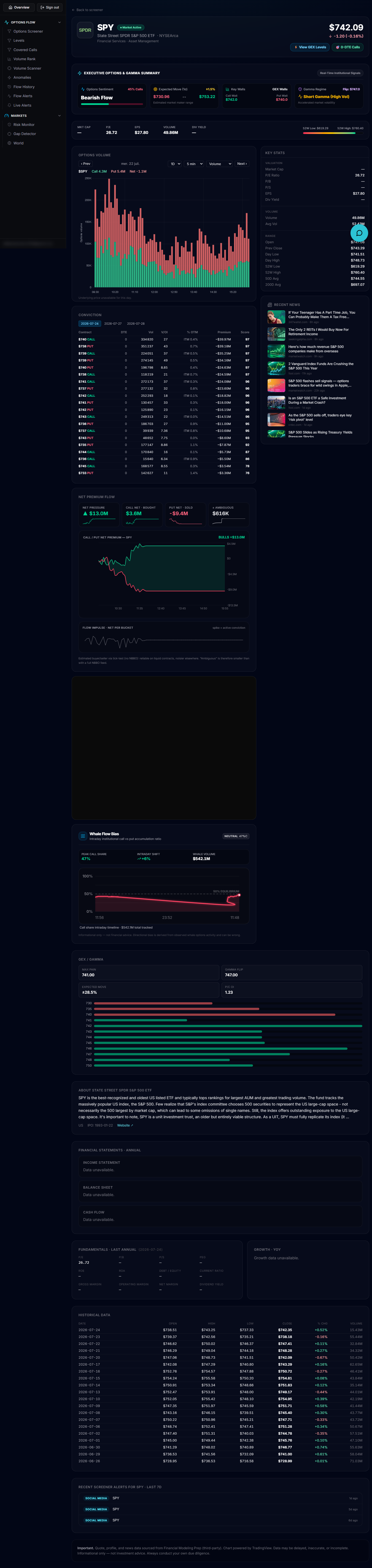
It isn't a left-rail destination of its own — it's a block on a ticker's stock detail page. Click any ticker from Live Options Flow, Volume Rank, Volume Scanner or the levels page (or open /account/screener/[ticker] directly) and scroll past the Options volume and Conviction sections to reach "Net premium flow."
The tiles
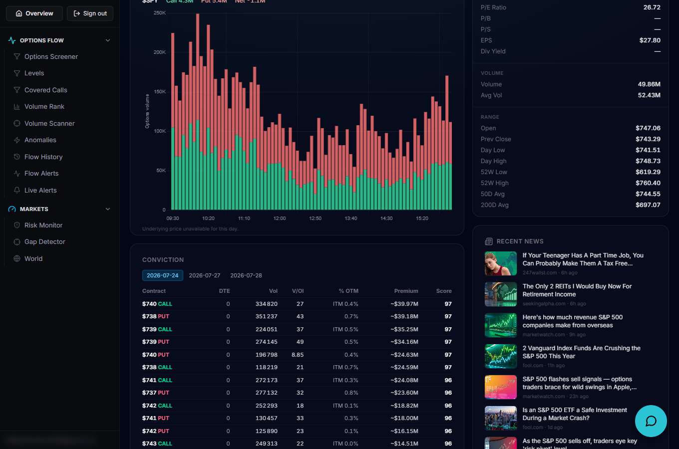
Four tiles sit above the chart: Net pressure (which side — Bulls or Bears — currently has the larger net premium, and by how much), Call net (bought or sold), Put net (bought or sold) and ± Ambiguous (premium the tick-test couldn't confidently assign to either buyer or seller). Each tile carries its own small sparkline of that value's path through the session, and the whole view refreshes automatically every 10 seconds while the tab is visible.
Reading the chart
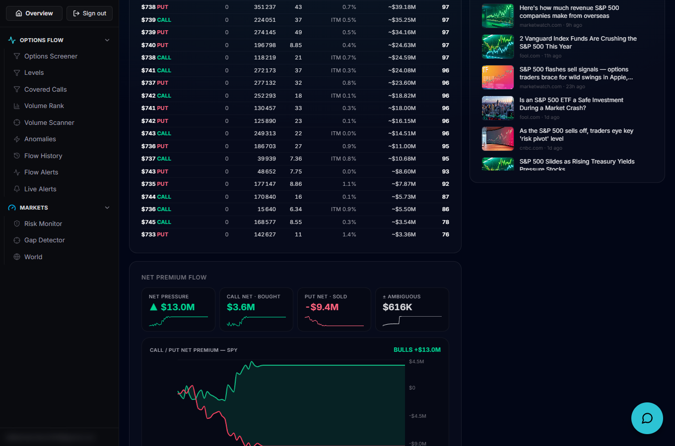
The main chart plots two cumulative lines — call net premium in green, put net premium in red — with a shaded ribbon filling the gap between them, colored for whichever side is ahead. A dashed grey line on its own axis overlays the underlying's price so you can line up premium shifts with price action. Hover any point for a tooltip with the exact call/put net and the leading side at that moment.
The impulse strip
Below the main chart, a thin "Flow impulse" strip plots the net premium per bucket rather than the cumulative total — a spike here (in either direction) marks a burst of one-sided conviction hitting the tape, as opposed to the steady grind the cumulative lines show.
Put it to work
Watch for the cumulative call and put lines diverging hard in one direction, or Net pressure flipping sides mid-session — both point to a shift in who's paying up for premium on that name right now. Keep in mind the buy/sell split is an estimated tick-test (no NBBO quotes), so it's more reliable on liquid contracts and noisier on thin ones — that's also why the Ambiguous tile exists.